Wednesday 24 November 2010

Ancillary Task - Digipak Finished(first draft)


This was our first draft of the digipak. the reasons for our changing of the digipak is because we have been enlightened that on an album there must be 10 - 12 tracks and more publishing information.

Tuesday 23 November 2010

Production Update

Yesterday (Monday 22nd, a study day), we went back to Lydia's house to begin filming for the music video.

Problems that occurred:
- one of the boys didn't turn up and we couldn't find a replacement
- two of the boiler suit zips broke
- it rained whilst filming
- the food ran out quicker than expected

How we solved them:
- we had to film four of us fighting but we'll edit in the other two characters later to make it seem as if they were hiding during the fight
-we sellotaped the broken suits
- we finished filming before it rained any harder
- we made some pink porridge from Lydia's food cupboard

We still have quite a bit more footage left to film, such as more for the opening sequence and live performance shots. Hopefully these shots will go much more smoothly and we'll be left in abundance of footage, so we can start editing as soon as possible to create a really good music video! :)

Ancillary Task Photos Raw (unfinished)


On Monday 15th November, Myself, Anna and Lydia along with our actors went to Lydia's house to take our ancillary shots for both the digipak and the magazine advertisement. We all worked together when creating the set/mise en scene and we each took our own photographs for the two panels that we each had in charge of. We have chosen the pictures that we want and think are best suited and have started editing them, we have also started on creating the digipak by using a template. We have still yet to decide on font, font colour etc.. however we will decide this in further production of the digipak.

Monday 22 November 2010

casting shots

Heather Ainsworth

Dann Allen

Mathew Savage

Lydia Welsh

Anna Clarey

Tuesday 16 November 2010

Album Cover and Advert Analysis


All-American Rejects album cover

Album covers tend to follow certain conventions; they attempt to sell the artist and the genre, and appeal to their target audience.

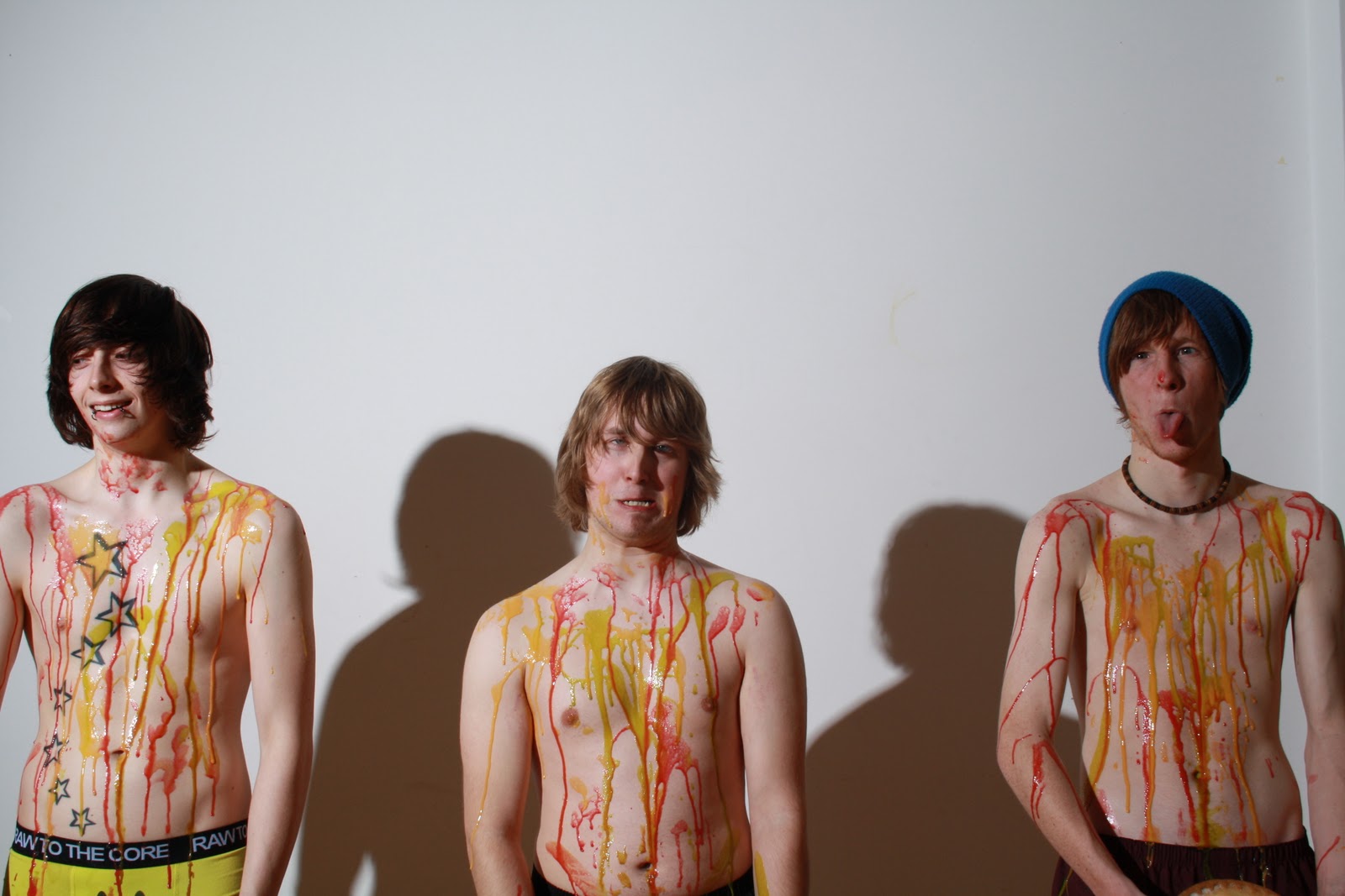
This album cover on the right is from a band who play pop-rock music, similar to 'HateBoss', the artist we've used in our coursework. The cover displays all of the band members, the band logo and album title; which helps fulfill its role as a product.

The familiar logo will immediately stand out to loyal and new fans alike, who will see the brand and instantly know what they're looking at because of the image created by the music company from AAR's previous two albums. This piece of familiarity creates a source of comfort for established fans, who feel confident when they recognise a label, it allows them to perceive the artists as established and reliable.

Putting the band members on the front also creates a connection with the audience, they see the people that they are effectively buying into, and put a name to a face, a voice to a body. On some level this should increase interest because the appearance of the band can very often lead to a person's interest in their music. Their positioning stances and clothing outline the kind of image they want to put across, simple but stylish and with attitude; this would appeal to a younger audience, drawing them to the product.

The album title displayed also gives quite a good indication of the genre; by putting it in clearly visibile font the audience can read it quickly and efficiently, and pick up any connotations.


The Verve magazine advert

< This is a magazine advert for 'The Verve's new single and upcoming album. Naturally, the advert takes a page, features either a) the artists' physical appearance or b) their logo. It also features the release date of their album; both of these are the primary conventions for this type of media text.

Magazine adverts generally take a whole page because not only is that the most common size, it allows more space and more advert to attract the reader. The amount of space can give the designers more creative freedom because they have a bigger gap to fill, so can use big ideas to fill it.

The design of this promotes the band as an entity rather than individual members. They choose to use a spiritual background photo which reflects the mood of the album being promoted, and would therefore appeal to certain people, perhaps in the 35-45 age range who're searching for an on-trend band who offer a gentle pace of music they feel comfortable with.

Finally, the display of the album release details is compulsory to the advert. These are often less prominent because they aren't used to attract the viewer, but inform them once they have been captured by the graphics of the text.

Monday 15 November 2010

Ancillary Task: Advert designs!

For the magazine advertisement each of us in the group will design an advert, we will then choose the one we think is the most effected for purpose and best suited to our target audience.

Here are my quick designs:

My original idea was to have a simple image of the band dominating the advertisement, this would introduce the band and allow them to stand out when flicking through a magazine. The album cover would be advertised next to the band with text saying "out now" to help promote the album/single. The bands name "Hate Boss" would be located at the top of the page which again introduces the band and of the text was to be large and bold would stand out and be eye-catching to the target audience. The remainder of the advertisement would be white space to allow the audience to focus on the band and their album and to not get side-tracked by other colours/images/effects.


However after seeing a film advertisement that i thought was really effective i decided to change my original idea and base a new idea on this. Again a main image of the band will dominate the page however instead of the band name being at the top of the page the band can be seen holding a large sign of the bands name which will be in the form on whipped cream which cooperates with the music video and the image. The album will be advertised at the top of the page as the advertisement is as much about advertisement the album/single as it is as the band therefore i thought that the album would be most noticeable if it was near the top of the page and in the eye line of the reader. Again the background will be white to allow the reader to focus on the band and their album.


By Heather Ainsworth

Feedback 15.11.10

Well done girls. You are well organised and getting on with the ancillaries, which is great to see. You need an analysis of an album cover and magazine advert - conventions of adverts, music genre, sense of brand identity etc. Perhaps do annotated pages like last year and then annotate of evaluate your own plans.

I will not be in lesson tomorrow (tues) but you should still attend lesson. Mike will let you in the room and be on hand in case you need anything.

Keep up the hard work!

Mrs A

Friday 12 November 2010

Costs and Cut-backs

After discussing how much money we'd be spending on props and costumes, we've come to the conclusion we could be spending £60 for our project. This seems a bit much, especially as the cost is split between only three of us, rather than everyone involved. The most expensive item was the £12 boiler suits we had planned to wear during the foodfight; so we've decided to re-evaluate our costumes and gone for the Rocky Horror-esque bin bag outfits.

We'll join together as a group next Wednesday after college and begin to design and make our costumes; we've researched some ideas for them, some seem quite complex, yet others are simple and effective. We'll be making dresses for the three girls, and hopefully some sort of suit for the guys.


Using these images from Google image search, we'll form ideas and outfits of our own style and suiting to help save us on production costs.

Ancillary Task: Magazine Advert

Magazine adverts for new albums aren't the most popular way for artists to promote their music because it's the lest effective method of reaching people. However, the few adverts that can be found, are generally found in magazines specifically dedicated to music, such as NME and Kerrang!

Usually, they take a full page of the magazine and pay the magazine for the advertisement space. The advert itself will hold conventions linked to its genre; those trying to sell a pop music album will more often than not feature the artist, because the artist, in this genre, is equally as popular as their music. In comparison, more niche genres tend to take more creative aspects, using graphics or photos which do not show the artist. This trend is the rule, not the exception; there are adverts which ignore this idea.


Photobucket


Photobucket

Each of us will create our own magazine adverts to demonstrate our individual input and styles. My idea involves a patchwork of photos of the band members, with a banner along the bottom including a picture of the album cover and release details.

Thursday 11 November 2010

Ancillary task planning: digipak!

As a group we have found a digipak template and have created a design that we think fits our band image and will appeal to the target audience.

Here is our design: for the front cover our initial idea is to have a medium-long shot of the three band members with cream pie's covering them down below. This will correspond with the band image that we are going to portray in the music video ( the food fight ). The bands name will appear at the top and will be in black font as this will contrast the white background that we will have and allow the name to stand out. The back cover of the digipak will in effect match the front however the back of the band members will be shown instead. The fold in panel in the digipak will be a picture of the lead singer (Dan)'s back of head and will contain a list of the tracks that will feature on the album, as we will use an image of Dan's head to feature on the cd cover we decided that as the fold in panel is on the back of the cd tray it would in effect create a  full 2D image of the lead singer.                                  

The inner panel's will feature close-up shots of the remaining two band members (Matt and Mike) covered in coloured custard/cream. This again will tie in with our band image in our music video. The names of the band members will also appear down the side of each member's face to introduce the band to the target audience.
By Heather Ainsworth

Digipaks!!

As part of the ancillary task we will be creating a digipak to promote our band, their single and their album. We will use a digipak template (see below) and as a group will each design two of the panels yet will keep to the band image throughout.


A band whom have used a digipak a few times are punk rockers Green Day. We can see the consistency of the brand image throughout the digipak and on the cd's, a typical element of their brand image is a colour palette of red & black and green & white, this is seen throughout the majority of the panels and most importantly on the front cover which instantly is recognisable as iconic of the band. The colour palette of green and white is used on one of the cd's which was their more popular colour palette in their early days which might still be recognisable with their older fans. Many close-up shots have been used to promote the band, we as a group will also use many close-up shots of our band to help promote them. We will also keep to a consistent colour palette and theme for our digipak which will be visible in our music video.


By Heather Ainsworth

Wednesday 10 November 2010

Research - Digipaks


 This is the Matchbook Romance digipak for their album stories and alibis this band is a bit more emo than us so it is quite serious and has a angry at the world feel. I am looking at this because this is a general digipak and you can clearly see the links all the way through. It has also enlightened me what may go in a digipak such as lyrics and maybe a poster. Also that to be successful the digipak must follow a scheme and each page must tie in.

By Lydia Welsh

Lyrics

As our band is very niche and not with a famous label, the lyrics to the song aren't online. As well as this the artist sings with an Italian accent which has made it a little difficult to properly work out what he's singing; but I've done my best to work them out and this is what I've got (any missing lyrics will be filled with a - ):

I gave you my reason
You don't understand
I gave you my secrets
I'm trying to forget

You gave me your deepest -
There's no more -
It's easy for you to fool me
I've no more regrets

Don't try to speak
Don't try to say a word
Don't try to speak
-

There's so much love to give
There's so much pain too            [x2]

Remember your candy kisses
Or right my wrong
You pick me with your -
Now leave me alone

Don't try to speak
Don't try to say a word
Don't try to be my
Kind of perfect love

There's so much love to give
There's so much pain too           [x4]


In my own interpretation, these lyrics depict a love hate relationship between a man and a woman, and it is the man who is singing the song in retaliation to how the woman has acted or treated him. Our video will display a conflict between three men and three women, which does reflect the lyrics. Despite this, the scenario we create will be loosely based on the lyrics; instead of taking an aggressive, troubled relationship aspect and focusing on the torment between two people, we've decided to take a lighter, more humourous approach. The food fight will illustrate the conflict between the characters, yet because the ammunition is just coloured food, we know nobody is really getting hurt, and we can enjoy the struggle between them without cringing at the sight of physical injury. By bringing in the school photo day context, we're trying to show that the fight fits in with something else and isn't just a fight for the sake of it- as well as this, incorporating something jeuvanille accentuates the fact that the relationship being portrayed, is potentially childish, and at the end of the day this song could be about two naive and fickle teenagers.

To justify our choices, the lyrics themselves are quite vague, there is no distinct narrative behind them which gives us creative freedom to interpret the lyrics as we choose. We developed our video concept on more than the lyrics, we tried to remember the nature of the genre we chose, and wanted to make sure that our video reflected the fun-loving, light hearted image of modern-day, pop-rock bands.

To conclude; though our video plot may not seem too grounded, it actually fits very well with Andrew Goodwin's theory of music video.
  • We have established an (albeit seemingly loose) relationship between the lyrics and the visuals
  • We have established a relationship between the music and the visuals
  • We have definitely looked into the genre of our music and tried to understand the type of video conventions associated with it
  • And we have attempted to fabricate a band image through our visuals to make it appear like our group is developing some form of iconography in their video.

Filming and editing schedule

This is our initial plan we have outlined for our filming, photo shoot and editing time. We have held a meeting and asked everyone when they are free and fitted it around all 8 schedules. We have this as a strict template but realise we may have to go out again if we haven't got every thing we need on the initial days.

10.11.10 - Green Screen Opening - 4.00pm-4.45pm

15.11.10 - Photo Shoot - 4.30pm - Late

17.11.10 - Editing and planning after college hours (Computer booked).

In between - finish editing digipack and magazine advert.

22.11.10 - Filming of food fight - 11am - Late (it gets dark/we get the shots we need)

24.11.10 - Upload footage, maybe extra filming for the end scene (Computer booked/May book green screen)

29.11.10 - Filming live production - 4.30pm - Late

This will give us 2 weeks to edit out film.

By Lydia Welsh

10.11.10 - Production Blog Update

Today we have filmed the opening sequence and done some casting shots. This included using the green screen and meeting the whole cast - we have made three takes so we have options when we load and edit. Today we also made a plan with the whole group of when we where going to film, do the photo shoot and edit everything. I found it very stressful and challenging trying to keep everyone happy and fitting it in all of our busy schedules but it was good because now it's done we can get on with no worries.

 By Lydia Welsh

Digipaks

Part of our coursework is to produce a Digipak for the band; Wikipedia describes a Digipak as this:

"Digipaks typically consist of a gatefold (book-style) paperboard or card stock outer binding, with one or more plastic trays capable of holding a CD or DVD attached to the inside. Digipak-style packaging is often used for CD singles or special editions of CD albums." - 'Digipak'; Wikipedia Novemeber 2010

Our own particular pack will have 6 sides, two inner panels, a CD tray, the fold in panel and front and back panels. The idea we had for this evolved from the music video concept we created; using a clear white background, we'll take close ups of the band members with coloured custard on them for four of the panels, and then the other two panels will involve all three of the members posing for the camera with more food! To share these responsibilities as well as possible, Heather, Lydia and I will take charge of two panels each, but all be there together for the photography session to make sure all of our photos are similar, to keep our work consistent.

Though digipaks seem smaller and neater than the usual 'jewel cases' for CDs, they are more likely to be worn out quicker, which can sometimes put a label off using them for their artists. However one of the most recent musicians to release their album as a digipak only, was Katy Perry with her album 'Teenage Dream'.

A foldout of the album

This digipak focuses on the artist as a product, using close ups and simple images, we look to the actual artist for the detail and this reminds us of whose music is on the album. However some digipak albums prefer to look at the lyrics in their music, and use graphics (with their lyrics) to fill the panels. We've decided to follow the former and use clear, concise, close-ups of our band members to really make the viewer appreciate the people who are making this music, and provide a window to the artist which effectively personalises the music for the audience.

Tuesday 9 November 2010

Props, costumes, etc...

For our music video there will be quite a few props and locations that will be needed. As a group we have all decided on where the locations will be and what aspects of the mise en scene we want.

Props list:

  • Stool
  • Food ( custard, cream )
  • 2x fold out tables
  • Make-up
  • Hairbrush/comb
  • Camera
For our props we will need to use a stool for the photo day shot so the student can sit on the stool in front of a white screen/wall to have their photo taken. Make-up and hairbrushes/combs will be used for the extreme close-up shots of the students getting ready. For the food fight shots we will need 2 fold out tables and some custard and cream to do the fight and finally of course we will need video camera's to film the video.

Costumes:
  • Boiler suits
  • Wellies
  • Pink belts
  • Suits
There will be 2 sets of costumes that will be seen throughout our music video, firstly suits/smart uniforms will be worn by the students whom are seen getting ready for the photo day, secondly the 6 main students will wear boiler suits as they will be involved in the food fight. The girls will wear a pink waste belt to give them a silhouette which can also be used to show female gaze. All characters will wear wellies.

Locations:
  • Woods located near Lydia's house
  • Spare room in Lydia's house for the live band performance
We have researched into the cost of the food that will be needed for the food fight, on www.asda.com we have found packets of custard mix for 6p per pack, a can of squirty cream for £1.00 and food colouring for 63p each.

http://groceries.asda.com/asda-estore/search/searchcontainer.jsp;jsessionid=yesdUqNlY336r5eVhryF7w**.oses4004-atg02?trailSize=1&searchString=custard&domainName=Products&headerVersion=v1&_requestid=9074

By Heather Ainsworth

Location Shots

This is the place where the food fight will take place.


Monday 8 November 2010

Update on production blog

We have come up with a new idea of where the school picture scene shall be photographed. To make it seem more realistic we're going to scrap the idea of doing it in a normal room but to do it in front of the green screen and insert a more realistic backdrop. This will keep the verisimilitude.

So we have booked out the media suite for Wednesday the 10th of November and have also organised actors and make-up for that day. Let The Filming Begin!

By Lydia Welsh

Feedback 8.11.10

Excellent! Still need to see the location and casting shots though girls please. Also, decipher and upload your lyrics and discuss whether/how your music video will amplify them.

Don't forget also, to continue blogging during production. I know you have booked the studio, organised your actors etc so make sure you record all this planning on here. You could take turns to type up the minutes of your production meetings and include them on your blog regularly. If you find anything else to inspire you throughout the process then keep adding it to this blog.

Try to organise your photoshoot for the ancillaries so that you can do this at the same time as the video shoots. Think about costume, poses etc and the brand image you are trying to portray. You could even start the research/planning for these ancillaries now whilst you are between jobs.See me for more info and/or checklist.

Keep up the hard work!

Mrs Abell

Friday 5 November 2010

The Shame to Hate Boss

Despite initially choosing Spanish band The Shame and their song 'Beautiful Day' for our coursework, after some mediation and executive decisions we have decided to change the track. We will now be using 'So Much' by HateBoss, an Italian band who can also be found on jamendo.com along with The Shame.

The effects of this will be minimal; the genre is almost exactly the same, the tempo and tone of the song is incredibly similar to Beautiful Day, and HateBoss' band image has the same young, modern and playful aspect as The Shame. There is less than a minutes difference in the actual song length so this shouldn't produce an issue either; we'll fill these gaps with generic music video shots from our footage.

The reasons for this change are that we cannot decipher the lyrics of the The Shame's song or find them on the internet, our attempts to contact the band have been fruitless too, we still have no reply from them. The HateBoss provide a good alternative; although this band doesn't have its lyrics anywhere online, they're much easier to work out by ear.

HateBoss' song 'So Much' on jamendo:

http://www.jamendo.com/en/track/601899

GreenScreen/ ChromaKey

As part of our video, we plan to use greenscreen, in order to understand the process better we had a brief session with a technician to learn how to use it. We were showed how to light the green screen and subject separately and properly; we then uploaded the footage onto Final Cut Express and added our own background to Lydia, as our subject. The image we used was simply uploaded from Google into the software, allowing us to see how the whole process looked after our efforts.


Us!

left to right: Anna, Lydia, Heather

Thursday 4 November 2010

Risk Assessment Form


We have filled out a risk assessment form to ensure that all participants are against any risk when creating our products.

By Heather Ainsworth and Lydia Welsh