Question One:
Question Two:
Question 2 Media
Question Three:
Question 3 media
Question Four:
Showing posts with label Lydia Welsh. Show all posts
Showing posts with label Lydia Welsh. Show all posts
Friday, 18 February 2011
Tuesday, 18 January 2011
Feedback video
This is the link to our feedback video, recorded in class.
http://www.youtube.com/watch?v=1nJrSFQEtMg
http://www.youtube.com/watch?v=1nJrSFQEtMg
Friday, 17 December 2010
Ancillary task- Finished Poster!!!

Wednesday, 15 December 2010
Digipak-finished!!!

Here is our finished digipak!! We have changed the font on the front and back cover to fit more with our brand image, the track listing has also been moved from the back of Dans head which originally was the inner panel, to the back panel to fit with the contemporary design of digipak/ c.d. more tracks have also been added as our first draft only contained a few tracks. The font colour on the back panel has also been changed to yellow to fit with the colour scheme and will hopefully stand out which will catch the eyes of our target audience. Our final adjustment has been added information (copyright etc) which can be seen in the footer of the back panel as only a little information was added in our first draft.
Saturday, 11 December 2010
Name Change.
Looking at the digipak and the magazine cover mock ups has let us see that the name of the band is rather boring and uncoordinated. whilst thinking of other suitable names we thought back to the first song we chose and have decided to use the name of the previous band we researched because it flows better and fits in with what we want to do with the graphics. So we shall call our band The Shame.
Update
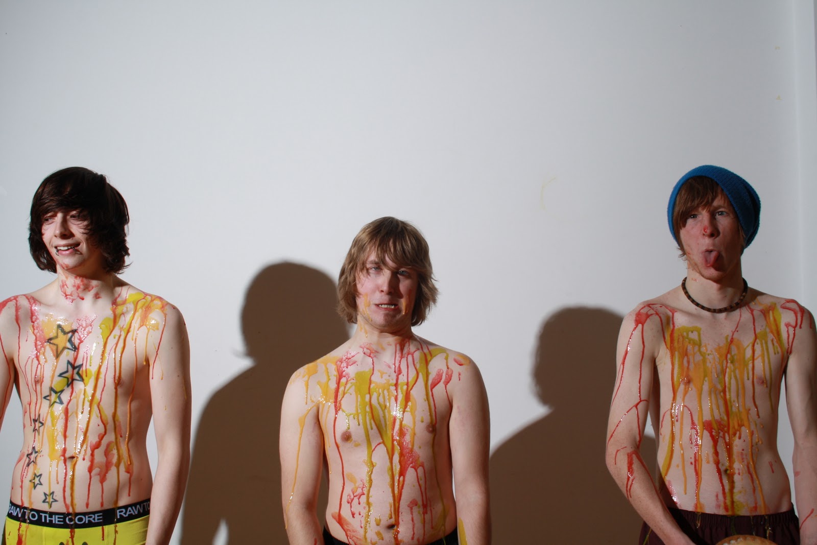
After putting together the photographs we decided that editing the colours in behind them looked rather amateur but we wanted some colour so we decided to pick out the colour yellow from the underpants of the drummer on the Digipak and have used that for select squares on a grid of the pictures which are mainly plain in background now.


These are the unedited photographs we will used for our magazine advert - we shall be cropping and blank out the blemishes in the back drop but we wont be editing them that much because we are quite happy with the lighting and clarity of the photos. We shall also pick one photograph of each member to change the background to yellow to add colour to the ad -this will draw the eye and add a feeling of fun and happiness to the photo because it is a bright colour and the band's brand image is about having fun.
Friday, 10 December 2010
Magazine Pictures!!!
Today we've done some further editing for our ancillary tasks and music video.


 Here are the edited pictures that will be featured on our magazine advertisement, we will be using 3 images of each of the band members as the design we have chosen contains 9 small images of the band members and also features the band name and album cover. There are different "poses" on each of the images to show the target audience that this band are young, fun, goofy yet the images fit our brand image that can be seen throughout our products. We plan to finish the magazine advertisement in our next lesson allowing us to then put our full attention into editing our music video.


Wednesday, 1 December 2010
Fonts/logos!

Digipak Editing
After our first draft of the digipak, we could look at what we'd done and make some criticisms. We're going to change the font of the band's name on the front cover; we'll work on this today, looking on dafont.com. After this we'll look at moving the tracklisting to the back cover, instead of an inside panel.
We want to change the font because the original wasn't very visually attractive, it didn't have a distinct appeal and stand true to the genre and brand image of The Shame. We needed something more bold, and more daring, that in effect acts as a logo. (Similarly to the font Katy Perry has on her albums and The Prodigy.)


We want to change the font because the original wasn't very visually attractive, it didn't have a distinct appeal and stand true to the genre and brand image of The Shame. We needed something more bold, and more daring, that in effect acts as a logo. (Similarly to the font Katy Perry has on her albums and The Prodigy.)


Posters and Photoshop


To create a professional look for our ancillary tasks we have had to edit our pictures, firstly we have cut the body of our main man Dan, as the original image had other cast members and an uneven background with shadows. We did this for all of our ancillary task photos to make them consistent throughout the products. For the magazine advertisement we had the idea of having coloured backgrounds to create a patchwork look....
The idea of nine pictures with brightly coloured backgrounds and a banner at the bottom of the poster, was meant to depict a Post-Modern, contemporary aura for the band. The patchwork idea brings colour, and attracts attention; allowing more than one focal point. This means that when someone comes across the poster, they'll stop to look at it because of the eye-drawing colour scheme; leading to them paying attention to the actual topic of the poster: The Shame.
Wednesday, 24 November 2010
Ancillary Task - Digipak Finished(first draft)

This was our first draft of the digipak. the reasons for our changing of the digipak is because we have been enlightened that on an album there must be 10 - 12 tracks and more publishing information.
Tuesday, 23 November 2010
Ancillary Task Photos Raw (unfinished)


On Monday 15th November, Myself, Anna and Lydia along with our actors went to Lydia's house to take our ancillary shots for both the digipak and the magazine advertisement. We all worked together when creating the set/mise en scene and we each took our own photographs for the two panels that we each had in charge of. We have chosen the pictures that we want and think are best suited and have started editing them, we have also started on creating the digipak by using a template. We have still yet to decide on font, font colour etc.. however we will decide this in further production of the digipak.
Monday, 22 November 2010


Tuesday, 9 November 2010


Monday, 8 November 2010
Update on production blog
We have come up with a new idea of where the school picture scene shall be photographed. To make it seem more realistic we're going to scrap the idea of doing it in a normal room but to do it in front of the green screen and insert a more realistic backdrop. This will keep the verisimilitude.
So we have booked out the media suite for Wednesday the 10th of November and have also organised actors and make-up for that day. Let The Filming Begin!
By Lydia Welsh
So we have booked out the media suite for Wednesday the 10th of November and have also organised actors and make-up for that day. Let The Filming Begin!
By Lydia Welsh
Friday, 5 November 2010
The Shame to Hate Boss
Despite initially choosing Spanish band The Shame and their song 'Beautiful Day' for our coursework, after some mediation and executive decisions we have decided to change the track. We will now be using 'So Much' by HateBoss, an Italian band who can also be found on jamendo.com along with The Shame.
The effects of this will be minimal; the genre is almost exactly the same, the tempo and tone of the song is incredibly similar to Beautiful Day, and HateBoss' band image has the same young, modern and playful aspect as The Shame. There is less than a minutes difference in the actual song length so this shouldn't produce an issue either; we'll fill these gaps with generic music video shots from our footage.
The reasons for this change are that we cannot decipher the lyrics of the The Shame's song or find them on the internet, our attempts to contact the band have been fruitless too, we still have no reply from them. The HateBoss provide a good alternative; although this band doesn't have its lyrics anywhere online, they're much easier to work out by ear.
HateBoss' song 'So Much' on jamendo:
http://www.jamendo.com/en/track/601899
GreenScreen/ ChromaKey
As part of our video, we plan to use greenscreen, in order to understand the process better we had a brief session with a technician to learn how to use it. We were showed how to light the green screen and subject separately and properly; we then uploaded the footage onto Final Cut Express and added our own background to Lydia, as our subject. The image we used was simply uploaded from Google into the software, allowing us to see how the whole process looked after our efforts.

Subscribe to:
Posts (Atom)