
Friday, 17 December 2010
Ancillary task- Finished Poster!!!
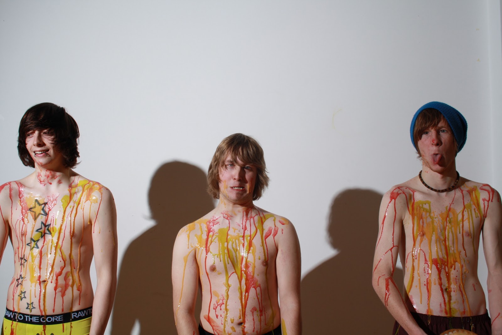
Thursday, 16 December 2010
School picture!!

At the end of our music video our initial idea was to have a group photo of the band members in their boiler suits after the food fight, however due to certain circumstances we were unable to get the photo of them in their boiler suits so i have still created a school photo of them using the same background that will be used for our green screen background, however i have had to use an image of them without the boiler suits on yet they still are covered in food to show they have had a food fight.
Wednesday, 15 December 2010
Digipak-finished!!!

Here is our finished digipak!! We have changed the font on the front and back cover to fit more with our brand image, the track listing has also been moved from the back of Dans head which originally was the inner panel, to the back panel to fit with the contemporary design of digipak/ c.d. more tracks have also been added as our first draft only contained a few tracks. The font colour on the back panel has also been changed to yellow to fit with the colour scheme and will hopefully stand out which will catch the eyes of our target audience. Our final adjustment has been added information (copyright etc) which can be seen in the footer of the back panel as only a little information was added in our first draft.
Monday, 13 December 2010
Production Update!!
Today (13/12/10) we are filming the remainder of our music video which will consist of some of the band performance, mainly shots of the drums. We are also continuing with our editing of the music video as our deadline is fast approaching. I will also be editing a still shot of the gang to feature at the end of the video which shows them as the class of 2010.
Saturday, 11 December 2010
Name Change.
Looking at the digipak and the magazine cover mock ups has let us see that the name of the band is rather boring and uncoordinated. whilst thinking of other suitable names we thought back to the first song we chose and have decided to use the name of the previous band we researched because it flows better and fits in with what we want to do with the graphics. So we shall call our band The Shame.
Update
After putting together the photographs we decided that editing the colours in behind them looked rather amateur but we wanted some colour so we decided to pick out the colour yellow from the underpants of the drummer on the Digipak and have used that for select squares on a grid of the pictures which are mainly plain in background now.


These are the unedited photographs we will used for our magazine advert - we shall be cropping and blank out the blemishes in the back drop but we wont be editing them that much because we are quite happy with the lighting and clarity of the photos. We shall also pick one photograph of each member to change the background to yellow to add colour to the ad -this will draw the eye and add a feeling of fun and happiness to the photo because it is a bright colour and the band's brand image is about having fun.
Friday, 10 December 2010
Magazine Pictures!!!
Today we've done some further editing for our ancillary tasks and music video.


 Here are the edited pictures that will be featured on our magazine advertisement, we will be using 3 images of each of the band members as the design we have chosen contains 9 small images of the band members and also features the band name and album cover. There are different "poses" on each of the images to show the target audience that this band are young, fun, goofy yet the images fit our brand image that can be seen throughout our products. We plan to finish the magazine advertisement in our next lesson allowing us to then put our full attention into editing our music video.


Thursday, 9 December 2010
Live Performance
Yesterday afternoon, we stayed in college to film some live performance. Only two of the members could turn up but we aren't in a position to be picky so we had to make do and we'll be filming more live perfomance at some point, so we'll try even things out in editing.
We filmed the members against a white screen which was lit seperately from the boys themselves, in order to get a brighter background and better overall image. Most of the footage involves close ups of the guitar which will be incorporated into the video through a series of jump cuts, between live performance and the video itself. As well as this we had close ups of Dan singing, all of this will be lip-synced and hopefully be up to scratch for the deadline.
We filmed the members against a white screen which was lit seperately from the boys themselves, in order to get a brighter background and better overall image. Most of the footage involves close ups of the guitar which will be incorporated into the video through a series of jump cuts, between live performance and the video itself. As well as this we had close ups of Dan singing, all of this will be lip-synced and hopefully be up to scratch for the deadline.
Monday, 6 December 2010
Update!
These last two weeks have crept up on us incredibly fast and a heck of a lot needs to be refined for our final submission of work. This isn't an excuse of course, it's been the same for everyone, but it certainly hasn't been a breeze!!
This week we've been working more on the ancillary task, working on fonts and editing picture which will eventually make the magazine advert. We still have some footage left to film which is the biggest issue, because we have all six of us to think of when scheduling times, places and things to film, we're struggling to fit it into our time limit a little.
Naturally, we're doing our best and hope to get all of this sorted and edited by the holidays. Tomorrow we have a media lesson in college, so we'll be working on the digipak, making the changes that we need to make it better. We'll also be planning out another filming session in order to start editing our video as soon as possible.
Thursday, 2 December 2010
Poster Mock-Ups (3)
 |
| Mock Up 3: this concept is the one closest to my original. We have a much more obvious patchwork of photos which is more interesting and motivating visually. Though the gap at the bottom is smaller and doesn't have as much room for details as the first mock-up, there is still enough room for everything needed, and it can all be arranged so that nothing looks squashed. The point of this being there's more space for pictures of the band, this creates a link with the viewer because they are getting picture evidence of the product in front of them, and a clearer image of what they'd be buying into. |
Poster Mock-Ups (2)
 |
| Mock Up 2: This poster incorporates more images of the band members to create more space for them to be seen, in reality these images wouldn't be repeated, we'd use new images with shades corresponding to the other photos of that member. For example, Jordan's photos would have different shades of purple in the background, while Dan would have shades of pink, and Matt shades of green. However, the final and official colours have not been chosen as of yet. |
Poster Mock-Ups
I've been working on some mock-ups for my poster idea, they're very simple layouts but will hopefully give us a general idea of which idea we want to persue for definite.
 |
| Mock-Up 1: Sadly this image has been slightly distorted, but nonetheless we can see what's meant to be going on. We have individual photos of each band member, a space for the album cover, and space for the band's logo and realease details. Criticisms of this design are how it look a little sparse, there isn't too much going on, so we'd need to develop it visually. |
Wednesday, 1 December 2010
Fonts/logos!

Digipak Editing
After our first draft of the digipak, we could look at what we'd done and make some criticisms. We're going to change the font of the band's name on the front cover; we'll work on this today, looking on dafont.com. After this we'll look at moving the tracklisting to the back cover, instead of an inside panel.
We want to change the font because the original wasn't very visually attractive, it didn't have a distinct appeal and stand true to the genre and brand image of The Shame. We needed something more bold, and more daring, that in effect acts as a logo. (Similarly to the font Katy Perry has on her albums and The Prodigy.)


We want to change the font because the original wasn't very visually attractive, it didn't have a distinct appeal and stand true to the genre and brand image of The Shame. We needed something more bold, and more daring, that in effect acts as a logo. (Similarly to the font Katy Perry has on her albums and The Prodigy.)


Posters and Photoshop


To create a professional look for our ancillary tasks we have had to edit our pictures, firstly we have cut the body of our main man Dan, as the original image had other cast members and an uneven background with shadows. We did this for all of our ancillary task photos to make them consistent throughout the products. For the magazine advertisement we had the idea of having coloured backgrounds to create a patchwork look....
The idea of nine pictures with brightly coloured backgrounds and a banner at the bottom of the poster, was meant to depict a Post-Modern, contemporary aura for the band. The patchwork idea brings colour, and attracts attention; allowing more than one focal point. This means that when someone comes across the poster, they'll stop to look at it because of the eye-drawing colour scheme; leading to them paying attention to the actual topic of the poster: The Shame.
Wednesday, 24 November 2010
Ancillary Task - Digipak Finished(first draft)

This was our first draft of the digipak. the reasons for our changing of the digipak is because we have been enlightened that on an album there must be 10 - 12 tracks and more publishing information.
Tuesday, 23 November 2010
Production Update
Yesterday (Monday 22nd, a study day), we went back to Lydia's house to begin filming for the music video.
Problems that occurred:
- one of the boys didn't turn up and we couldn't find a replacement
- two of the boiler suit zips broke
- it rained whilst filming
- the food ran out quicker than expected
How we solved them:
- we had to film four of us fighting but we'll edit in the other two characters later to make it seem as if they were hiding during the fight
-we sellotaped the broken suits
- we finished filming before it rained any harder
- we made some pink porridge from Lydia's food cupboard
We still have quite a bit more footage left to film, such as more for the opening sequence and live performance shots. Hopefully these shots will go much more smoothly and we'll be left in abundance of footage, so we can start editing as soon as possible to create a really good music video! :)
Ancillary Task Photos Raw (unfinished)


On Monday 15th November, Myself, Anna and Lydia along with our actors went to Lydia's house to take our ancillary shots for both the digipak and the magazine advertisement. We all worked together when creating the set/mise en scene and we each took our own photographs for the two panels that we each had in charge of. We have chosen the pictures that we want and think are best suited and have started editing them, we have also started on creating the digipak by using a template. We have still yet to decide on font, font colour etc.. however we will decide this in further production of the digipak.
Monday, 22 November 2010


Tuesday, 16 November 2010
Album Cover and Advert Analysis
 |
| All-American Rejects album cover |
Album covers tend to follow certain conventions; they attempt to sell the artist and the genre, and appeal to their target audience.
This album cover on the right is from a band who play pop-rock music, similar to 'HateBoss', the artist we've used in our coursework. The cover displays all of the band members, the band logo and album title; which helps fulfill its role as a product.
The familiar logo will immediately stand out to loyal and new fans alike, who will see the brand and instantly know what they're looking at because of the image created by the music company from AAR's previous two albums. This piece of familiarity creates a source of comfort for established fans, who feel confident when they recognise a label, it allows them to perceive the artists as established and reliable.
Putting the band members on the front also creates a connection with the audience, they see the people that they are effectively buying into, and put a name to a face, a voice to a body. On some level this should increase interest because the appearance of the band can very often lead to a person's interest in their music. Their positioning stances and clothing outline the kind of image they want to put across, simple but stylish and with attitude; this would appeal to a younger audience, drawing them to the product.
The album title displayed also gives quite a good indication of the genre; by putting it in clearly visibile font the audience can read it quickly and efficiently, and pick up any connotations.
 |
| The Verve magazine advert |
< This is a magazine advert for 'The Verve's new single and upcoming album. Naturally, the advert takes a page, features either a) the artists' physical appearance or b) their logo. It also features the release date of their album; both of these are the primary conventions for this type of media text.
Magazine adverts generally take a whole page because not only is that the most common size, it allows more space and more advert to attract the reader. The amount of space can give the designers more creative freedom because they have a bigger gap to fill, so can use big ideas to fill it.
The design of this promotes the band as an entity rather than individual members. They choose to use a spiritual background photo which reflects the mood of the album being promoted, and would therefore appeal to certain people, perhaps in the 35-45 age range who're searching for an on-trend band who offer a gentle pace of music they feel comfortable with.
Finally, the display of the album release details is compulsory to the advert. These are often less prominent because they aren't used to attract the viewer, but inform them once they have been captured by the graphics of the text.
Subscribe to:
Comments (Atom)